Hello everyone! I want to do a write-up of another failed website that I have tried to make in order to earn some side income. The attempt has been a bit different from the previous one – I have built a minimal viable product in this case. I have done that so that I could try out my hypothesis about the feasibility and viability a bit more but, of course, it took more time. But I have tried to take every shortcut that I could have thought of.
I’m really not mad about it failing because the absolute majority of startups fail and we mostly only hear the success stories. Let me share my failure story so that we could all learn a bit from it.
I will start by introducing the problem, the tech I have used to solve it, what are the main problems, and why I think that it hasn’t taken off.
The Problem Statement
Most of the biggest grocery shops in Lithuania regularly print these small magazines with discounts. They look something like this:
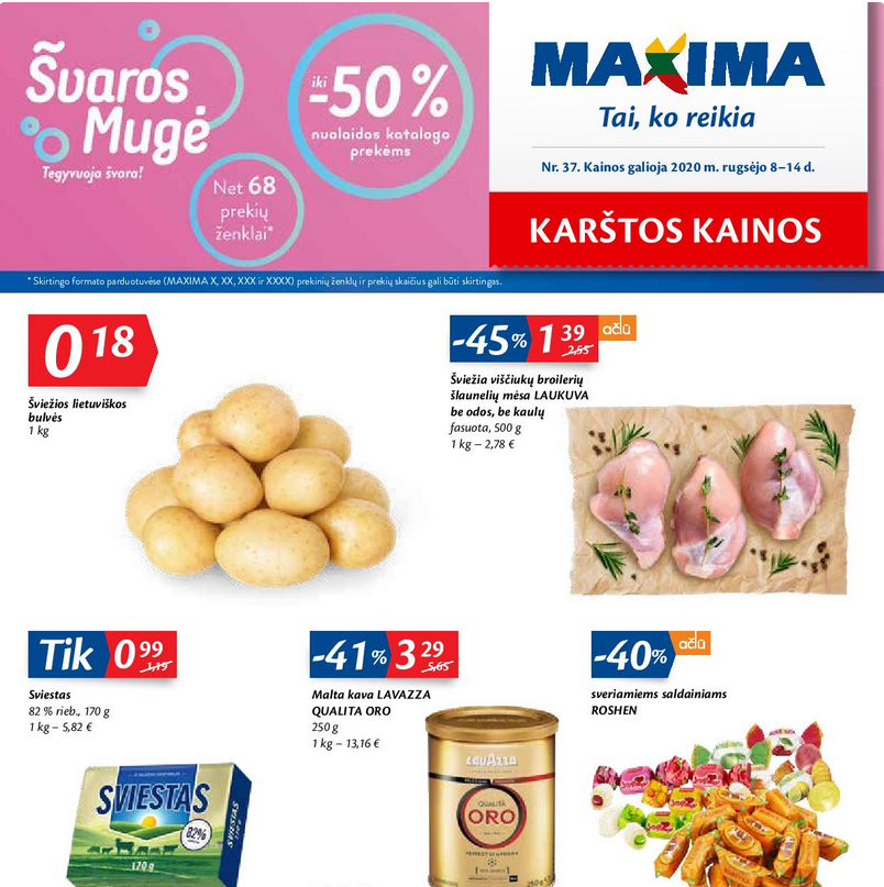
Since all of the main shops put out these magazines, a question arises: where it is relatively the cheapest to do regular grocery shopping at any given day? We could take this data and answer this question by using it.
However, one problem immediately arises: how can we parse all of that text inside of images? All of the magazines have different fonts, colors, not to mention the layout and other important things. After some research, I have found out that most if not all of this data are available online. Now it simply became a matter of building parsers and a website.
The Tech
I bought the domain for a few dollars from Namecheap. Then, I have used free Google Cloud credits to host the actual website. This permitted me to save as much as possible on costs. The actual website was hosted on a single virtual machine with no fancy deployment procedures. Since it barely got any requests at all, I have allowed myself to “deploy” by simply copying over a compiled binary that had served the backend. I have done a similar thing with all of the other configuration files. I believe that there is really no point in doing fancy anything on the infrastructure side if your goal first and foremost is to test if your MVP is even viable and if it is worth investing more of your time into it.
I have used the Caddy server to set up the HTTP server quickly with HTTPS. The new version 2 configuration file syntax is really to understand and it is much quicker to deploy simple configurations with Caddy when compared to nginx, in my humble opinion.
A mono repo has suited my needs well because I was able to put all of the source code into one place. It was very easy to write the back-end with Go and the Gin framework. The content of discounts was stored in Elasticsearch because it provides excellent features if you want to build a full-blown search engine. It was trivial to add caching with this library and Oliver’s Go Elastic client is really great! The modern web has a mechanism called CORS which improves security. But, because I wanted to build something as quick as possible due to the fact that I wasn’t sure if it was viable at all, I had resorted to enabling all calls via this library and calling r.Use(cors.Default()). I would definitely recommend checking all of these libraries and frameworks out if you are going to build something similar.
For scraping, I wanted to use a more dynamic programming language. Python seemed like a perfect fit because I had known it already and it has an excellent framework for writing scrapers – scrapy. I was able to write scrapers rapidly and it was a breeze to deploy them in a virtual Python environment on the server.
Also, I have almost no graphic design skills so I tried to use some framework for the site. That way, I don’t have to spend hours fiddling with pushing things to the left or right by some number of pixels. Buefy is excellent for this.
The logo is not an exception. I got the logo made for a few euros on Fiverr. The people there really do awesome work and it felt like a bit of a steal to get the logo made for a few euros. It even came with a few different variants and I chose one! I forgot to ask for another one for the top-bar so I made that “N” letter quickly on some word art generator site whose name I do not quite remember anymore.
The Site
Now that we went over the problem statement and the tech behind the site, it is time to actually introduce how the site looked like via screenshots.
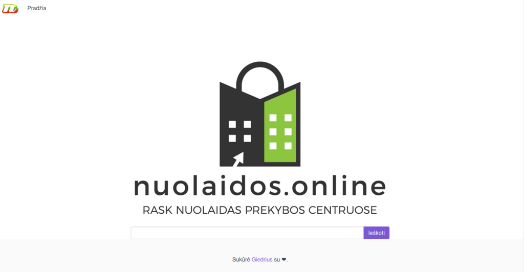
Once you enter the site, you see a simple search bar that gives you suggestions once you click on it. You can also enter some grocery’s name to get discounts for it.
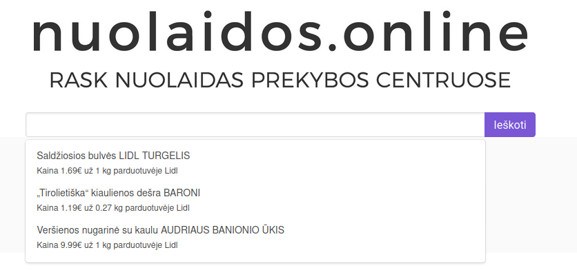
Here is how a sample of suggestions looked like. You can see that all of the three items are from the same shop – Lidl. Also, the units are being shown so that the user could understand relatively how much everything costs.

The error page looked like this:

It tells you that nothing called “foobar” has been found and suggests you to search for something else. Finally, the detailed results page the actual data plus all of the other related products and how do their prices compare:
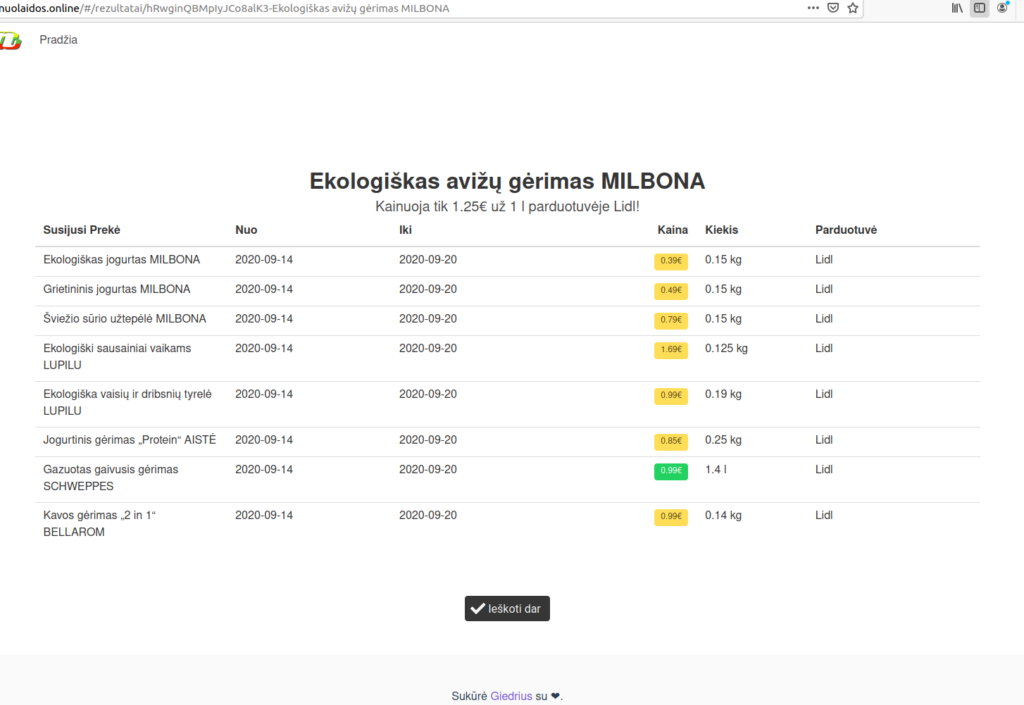
The price has a green background color when it costs less i.e. we can buy more kilograms or liters of that item with the same amount of money. For simplicity, I have made it so that 1 kilogram is equal to 1 liter in this comparison but, obviously, that is not true in reality. This is just for simplicity.
Another option would have been to separate liters and kilograms and only show one unit when trying to gather related items – the one that is used in the original definition. But, I feel that it would have led to too few results on that page. Most of the items were in kilograms so I was afraid that if a user had opened an item that has been defined in liters, there would have been barely any related items if any.
That’s more or less everything for the site itself. You already might have some ideas on why this hasn’t worked out but I have some guesses on that topic as well. Let’s see if they match.
Roadblocks
The first and probably most painful one is that the sites for which one has written scrapers change and quite often. Even though I wrote my scrapers a few months ago, only two of them are working at all right now. I think that iki.lt completely redesigned their website a few weeks after I wrote a scraper for it. This means that the scrapers are a continuous investment because you have to maintain them so that they would continue to work.
Another thing is that I think that there is not enough data for this kind of website unless you’d actually go and mark down the prices in grocery shops.
The discount magazines simply don’t provide enough absolute data for a person to make a decision on to which grocery shop they ought to go. The magazines might look big and with lots of information when you touch them in real life but actually, most of the discounts there are percentage discounts. And they are kind of useless for our use-case. I came to the realization that their sole purpose is to entice you to come to their shop – the font colors and sizes of the percentages are quite big most of the time to catch your eye, and they typically do not provide absolute prices of the most fundamental food that you would usually buy on each day. I am talking about such stuff here as cheese, bread, pasta, et cetera.
One of the surprising things that I have learned is that dynamically generated pages still mostly get indexed by Google, even if that content does not appear immediately. I had some qualms that doing Google’s search engine optimization might be impossible but I was wrong. In retrospect, I can see why because a lot of webpages nowadays use a single page application framework such as ReactJS or Vue and do client-side rendering so the search engines could potentially lose out on lots of valuable information by not indexing those pages.
Conclusion
All in all, I’m not too sad that this hasn’t worked out. The absolute majority of startups in general fail but that’s OK. I think the most important things to take from this are the lessons that I have learned not just on technology but on trying to understand the user’s perspective. Fortunately, the costs have been minimal because really a lot of services are free nowadays. For instance, I have used GitHub for storing the code. What’s more, excellent free and open-source libraries such as VueJS allow anyone to quickly iterate over different versions and improve everything quickly with features like “hot reload”.
Perhaps this might come back in the future in the form of an app that tells you where is the nearest place near you that is the cheapest for ordinary grocery items but alas the same issues apply as mentioned previously. Time will tell.
